
 Website audit
 SEO audit
 Technical audit
 UX & Conversion audit
 AI/LLM Visibility audit
 Ecommerce audit
This time we went through 50+ law firm websites - personal injury, car accident, truck accident, medical malpractice, and wrongful death attorneys across Phoenix, Dallas, Denver, and Sacramento. We focused on the things that decide whether a potential client stays or leaves: does the site make sense at first glance, how easy is it to get in touch, can they find a phone number fast, do the reviews look real, does the page work on mobile, is there a clear reason to call this firm and not the next one. The same 10 mistakes showed up again and again. Here's what we found.
The 10 Most Common Issues
| # | Issue | Found on | Impact Level |
|---|---|---|---|
| 1 | Unverified Reviews | 43 / 50 sites | 🔴 Critical |
| 2 | No Sticky Header With a Phone Number | 24 / 50 sites | 🔴 Critical |
| 3 | Chat Windows That Open on Page Load | 19 / 50 sites | 🟠 High |
| 4 | "You Don't Pay" Hidden Below the Fold | 10 / 50 sites | 🔴 Critical |
| 5 | City Skyline as Hero Image | 12 / 50 sites | 🟠 High |
| 6 | Phone Numbers That Aren't Clickable | 14 / 50 sites | 🟠 High |
| 7 | First Screens With No Hierarchy | 17 / 50 sites | 🟠 High |
| 8 | Walls of Text That Nobody Reads | 17 / 50 sites | 🟡 Medium-High |
| 9 | Missing Favicon | 7 / 50 sites | 🟡 Medium-High |
| 10 | Award Badges Instead of Real Social Proof | multiple sites | 🟠 High |
1. Unverified Reviews - 43 out of 50 websites
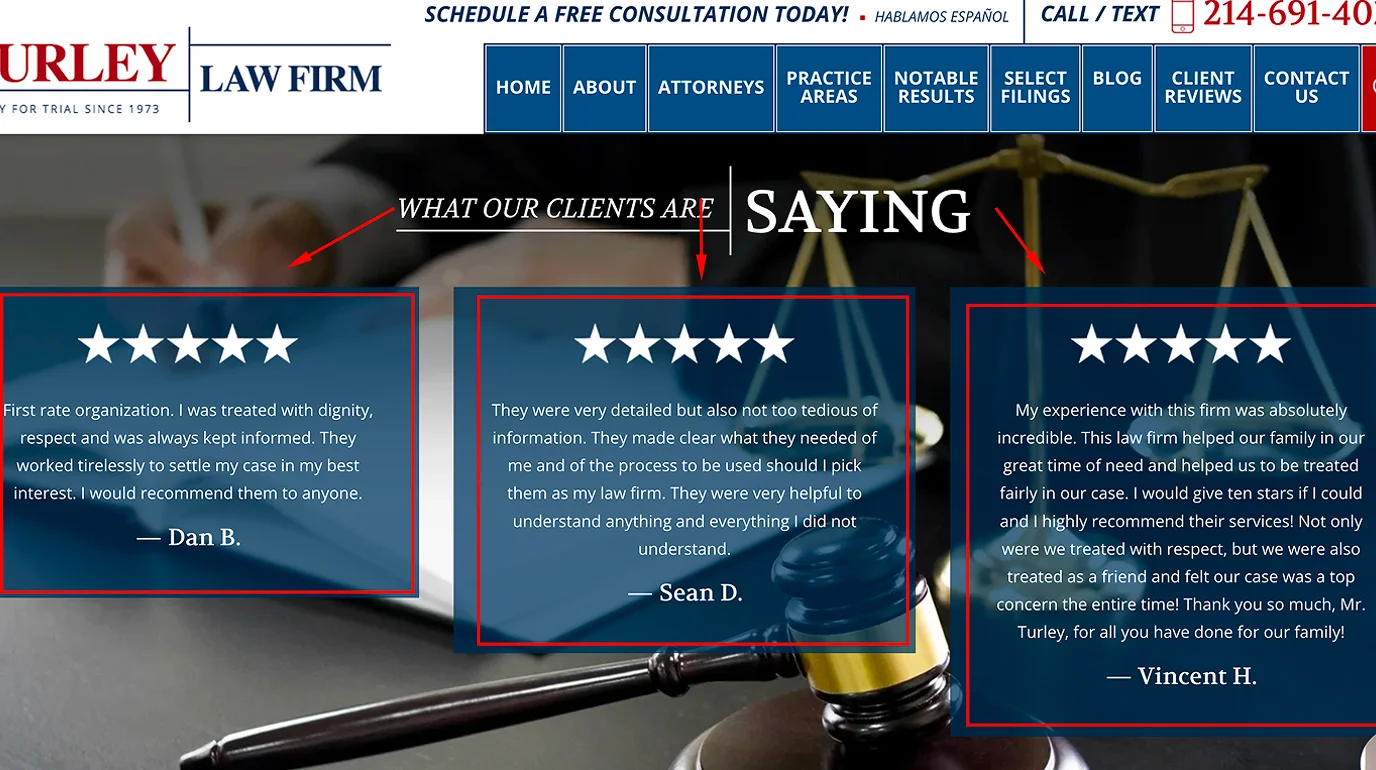
This was the single most common issue across the entire review. Testimonials on the page, no link to Google, no source, nothing to click.
I understand why it happens - someone copy-pasted reviews into the site years ago and moved on. But from a visitor's perspective, a block of text quotes with no names, no dates, and no way to check reads as invented. Even when the reviews are completely real.
The fix is very straightforward - link each testimonial to its Google review. Embed a Google Reviews widget that pulls live ratings. Show the star count with a direct link to your profile. Any of these takes 30 minutes to implement and immediately changes how the page feels. When someone is deciding whether to call a lawyer after an accident or a medical error, they're already stressed and skeptical. Verified reviews remove one major reason to hesitate - and that hesitation is often what sends them to the next firm on the list.
2. No Sticky Header With a Phone Number - 24 out of 50 sites
A potential client lands on the site, reads through the page, decides they want to call - and the phone number is gone. It was in the header at the top, but they've scrolled down and now they have to scroll back up to find it.
This sounds minor. It isn't. For personal injury and accident attorney sites specifically, the phone call is the conversion. Everything else on the page exists to get someone to pick up the phone. Hiding the number mid-scroll works against every other element on the site.
A fixed header that stays visible as you scroll - with a clickable phone number and a single CTA - is one of the simplest, highest-impact changes a law firm can make. I saw it missing on nearly half the sites I reviewed.
3. Chat Windows and Popups That Open Before You've Read Anything - 19 out of 50 sites
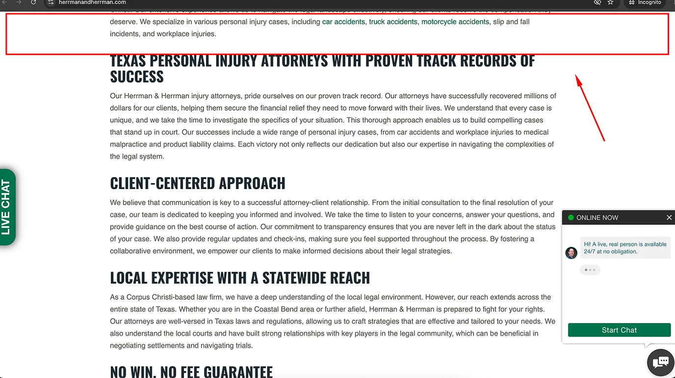
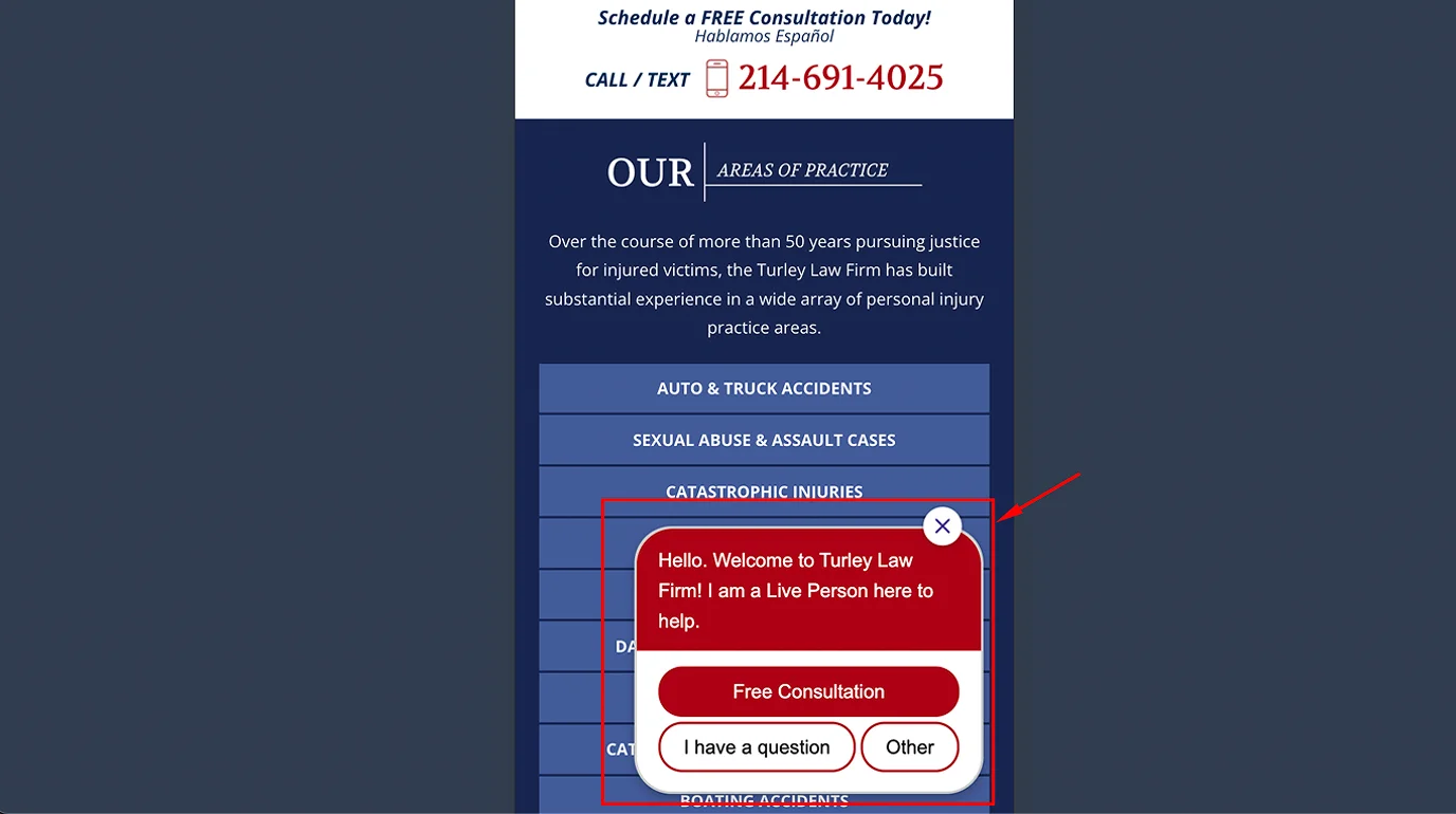
The page loads. Before the headline has finished rendering, a chat window slides up from the corner. Or a popup appears asking for an email address. Or a "can I help you?" assistant takes over half the screen. The visitor has been on the site for approximately two seconds.
I get the logic - be proactive, capture leads early. But in practice, it signals desperation more than helpfulness. On mobile especially, an auto-opening chat covers the content the person came to read, and the first interaction with the site becomes closing something they didn't ask for.
Chat works well when it's triggered by behavior - someone who's been on the page for 45 seconds, or who's scrolling toward the bottom, or who's on their third page visit. Not on page load. The first interaction with your site should be your content - not a close button.
4. The Most Important Line on the Page Is Hidden Below the Fold - 10 out of 50 sites
"You don't pay unless we win."
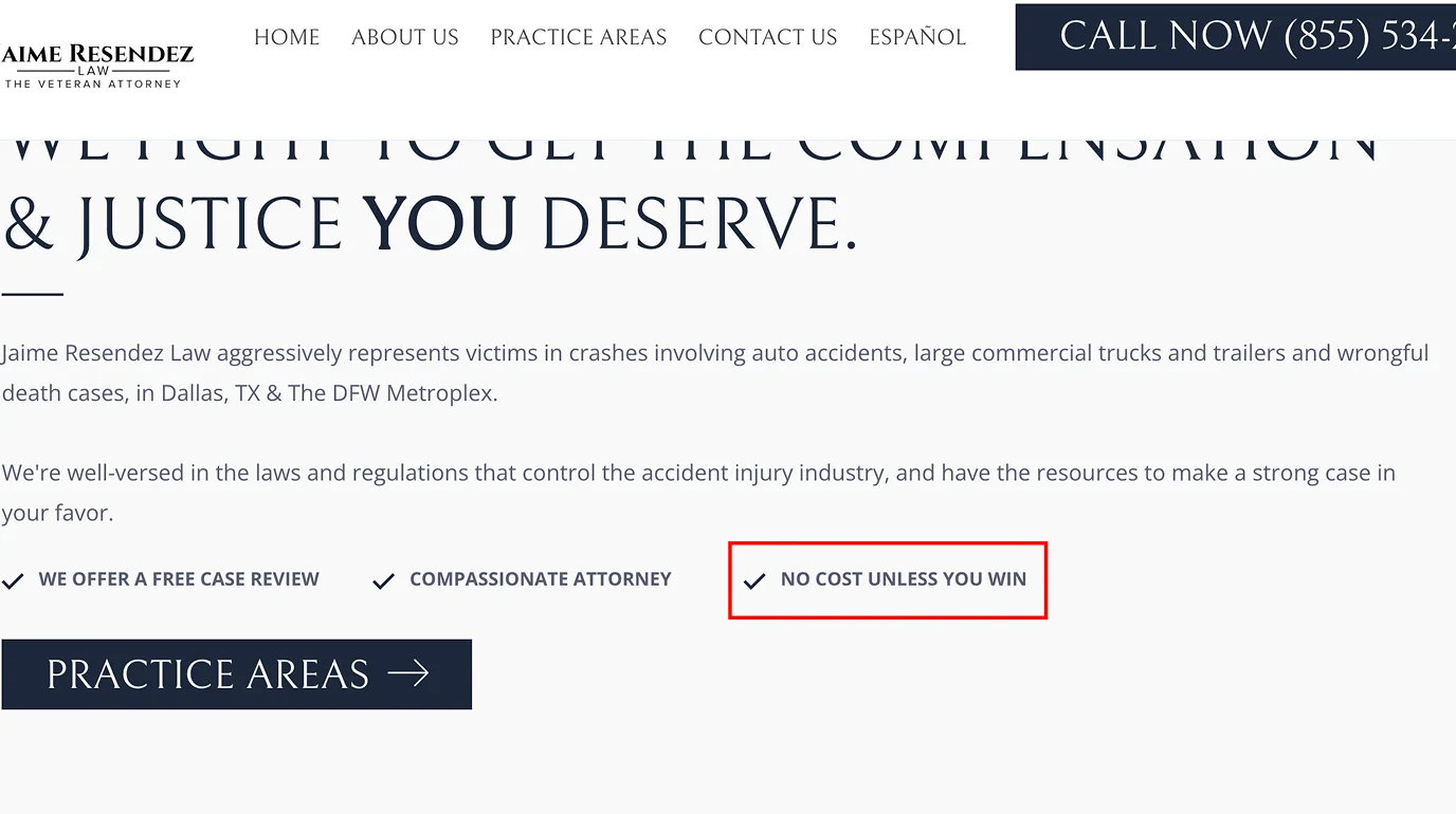
For personal injury, car accident, and wrongful death attorneys, this is the most powerful sentence on the entire website. It removes the single biggest reason people hesitate to call a lawyer: they assume it'll cost them money they don't have, especially right after an accident or a loss.
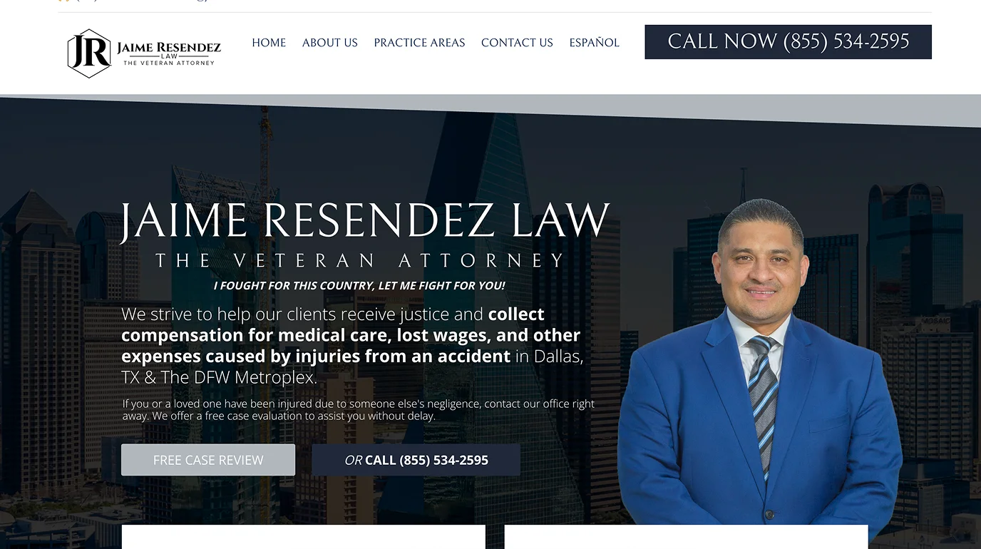
On 10 of the sites I reviewed, this line only appeared 4-5 screens deep - after the hero, after the practice areas, after the about section. The first screen had a headline, a CTA, and a lot of copy. But the one thing that would actually make a hesitant visitor pick up the phone? Nowhere in sight until they'd already scrolled through most of the page. Most visitors never get that far. It belongs in the hero section, visible before the user scrolls anywhere. If I had to choose one change for an injury attorney site, it would be this one.
5. A City Skyline Where the Value Proposition Should Be - 12 out of 50 sites
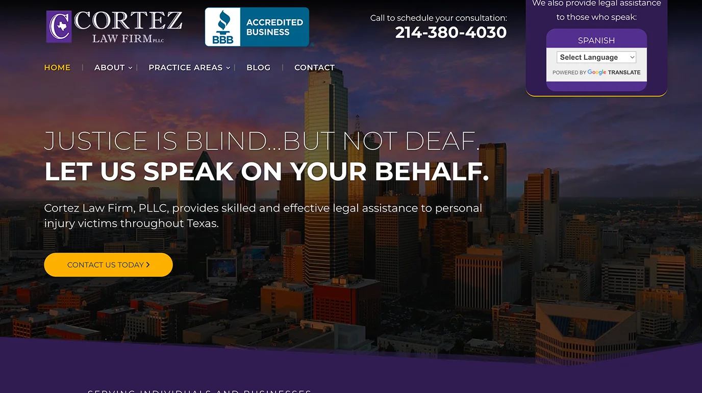
The Dallas skyline is a fine photo. It has nothing to do with why someone should call your firm.
The hero section of a law firm website is the most valuable real estate on the page. It's what every visitor sees before they do anything else. And on 12 of the sites I reviewed, that space was used for a stock photo of Phoenix, or Denver, or Sacramento at night.
The strongest hero sections I saw during this review had three things: a direct, specific headline that spoke to the visitor's situation, a visible phone number, and one clear call to action. That's it. No skyline required.
6. Phone Numbers That Aren't Clickable - 14 out of 50 sites
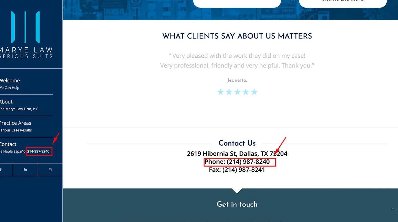
Most people searching for a personal injury or accident attorney are doing it on their phone. Many of them are doing it shortly after something went wrong - a car crash, a hospital visit, a sudden loss. They're not in the mood to memorize a number and dial it manually.
But this isn't only a mobile problem. On desktop, a phone number that isn't clickable means the visitor has to write it down, copy it, or switch to their phone to call. That's friction - small, but real. For someone who was already ready to call, that extra step is sometimes enough to make them reconsider.
A phone number that isn't wrapped in a tel: link is just text. One tap or one click should open the dialer. On 14 of the 50 sites I looked at, it didn't. This is a five-minute fix. The gap between "someone found your site" and "someone called you" should not include the step of copying and pasting a phone number.
7. First Screens With No Hierarchy - 17 out of 50 sites
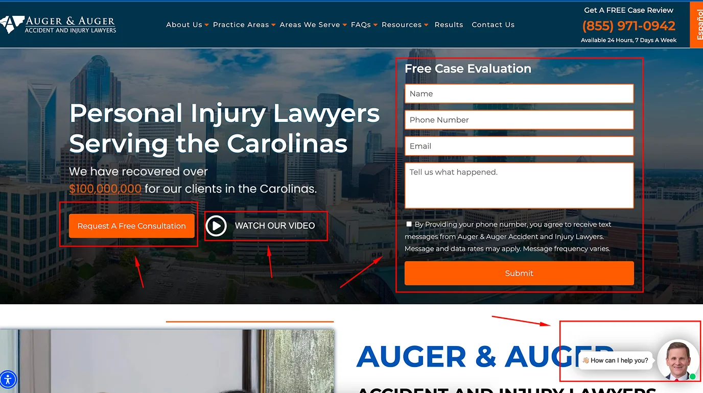
A city photo as background. A headline on the left. Two CTA buttons below it - "Request A Free Consultation" and "Watch Our Video." A full contact form with four fields on the right. And a chat widget opening in the corner before you've read a single word. All of this visible before the first scroll. When everything competes for attention, nothing wins. The visitor doesn't know where to look or what to do, so they do nothing - or they leave.
On desktop this can look dynamic and full. But even on a large screen, six competing elements in one view creates confusion, not conversion. And for law firms, this matters more than in most niches - the majority of people searching for a personal injury or accident attorney are doing it on their phone, often right after something went wrong. That's not the moment to present them with a form, two buttons, and a chat popup before they've understood what the firm even does.
The sites that converted best had one message and one action in the first screen: who you are, what you do, and how to reach you. Everything else came after the scroll.
If you want to run a proper UX audit on your own site, here are the best tools to do it.
8. Walls of Text That Nobody Reads - 17 out of 50 sites
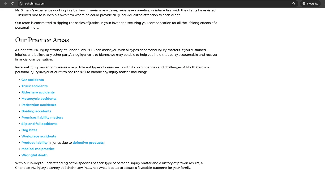
Law firms have a lot to say. Practice areas, case history, credentials, process explanations, jurisdiction details. They really have what to say, I understand why pages get so long. But long paragraphs with no headers, no bullets, no visual breaks don't get read - they get skipped. I saw pages where genuinely useful information (what to do after an accident, how the process works, what makes this firm different) was buried in blocks of unbroken text that most visitors would scroll past in under a second.
This is especially costly for injury and accident attorney sites. The person landing on the page is often confused, stressed, and making a fast decision. They're not going to read six paragraphs to find out if you handle their type of case. They're going to scan for three seconds, and if nothing catches their eye, they'll go back to Google.
The content needs to be structured with short paragraphs. Clear H2s for each section. Bullet points where a list makes more sense than a paragraph. A bold line for the one thing you most want them to remember. The same information - just readable.
9. Missing Favicon - 7 out of 50 sites
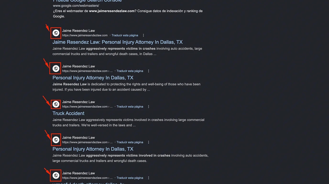
Small detail, real signal. When a site has no favicon - the small icon that appears in browser tabs and next to the page title in search results - the tab shows a blank page icon. In a window with 8 or 10 tabs open, which is how most people browse when they're comparing lawyers, that blank icon stands out immediately as unfinished.
For a firm where trust is the entire product, "this site looks unfinished" is a bad first impression to leave. A favicon takes 10 minutes to add and should be on every professional site without exception.
10. Award Badges Instead of Real Social Proof - visible on multiple sites
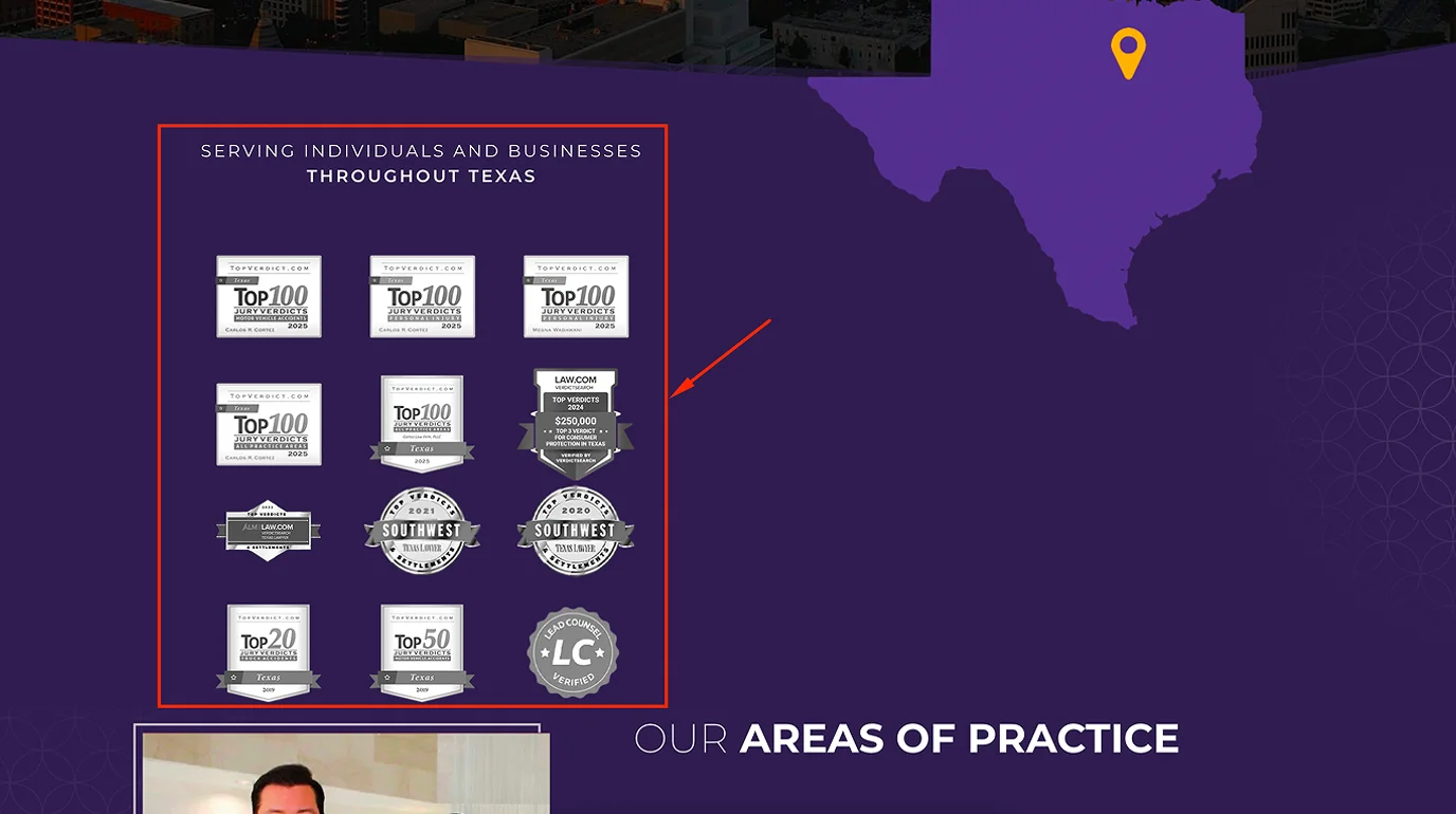
Several sites I reviewed had a section with badges - "Top Attorney 2022," "SuperLawyers," "Avvo Rating 10.0" - displayed prominently, sometimes animated, sometimes taking up significant space on the page.
I'm not saying awards don't matter. They do, and they can build credibility. But I noticed a pattern: the firms that leaned hardest on badge sections were often the same firms with no actual client reviews displayed on the page.
A badge tells a visitor that some industry organization rated you highly. A review from a real person who was in a car accident and got a settlement tells a visitor that someone in their exact situation trusted you and it worked out. These are not the same thing. Badges belong on the page. But they shouldn't replace client reviews - they should sit alongside them. When the choice is between a full row of award icons and three verified Google reviews, the reviews win every time.
What Connects All of This
None of these are technical problems. There's no JavaScript issue here, no crawl error, no schema markup missing. These are trust problems and friction problems - the kind that don't show up in Google Search Console but decide, every day, whether a visitor picks up the phone or goes back to the search results.
The law firm market is competitive in every city I looked at. In Dallas and Phoenix especially, personal injury and car accident attorneys are bidding aggressively on Google Ads. Firms are paying real money to get people to their sites. And then, on many of those sites, the same avoidable mistakes quietly cancel out that investment. Most of what's on this list can be fixed in a day or two. The harder part is seeing your own site the way a first-time visitor sees it - which is exactly what I was doing across those 50+ sites. If you want to know where your site stands, run a free audit at WebAudits.dev.
Frequently Asked Questions
My reviews are real - why would visitors doubt them?
Because they have no way to know that. A block of text quotes looks the same whether it's real or invented. The reviews aren't the problem - the lack of a source is. One link to your Google profile changes the entire perception.
We have a chat on our site - should we remove it completely?
No. Chat can be a strong lead capture tool for law firms. The issue is timing - set it to trigger after 30-45 seconds on page, or after the user scrolls 50% down. Not on page load. Most chat tools (Tidio, Intercom, LiveChat) have this setting built in.
We updated our site two years ago - is that recent enough?
Depends on what was updated. A two-year-old design isn't the issue - outdated copyright years, broken elements, or a site that doesn't work well on current mobile screen sizes are. The question isn't when it was built, it's whether it works the way a visitor expects it to work today.
My site gets traffic but almost no calls. Could these issues be the reason?
Very likely, yes. Traffic without calls is almost always a trust or friction problem - not a traffic problem. If people are landing on your site and leaving without contacting you, the issues in this article are the first place to look before spending more on ads.